Advertisement
See This Map? It’s Strange Looking, But Also the Most Accurate World Map Created
| By Margo Gothelf
Advertisement - Continue reading below
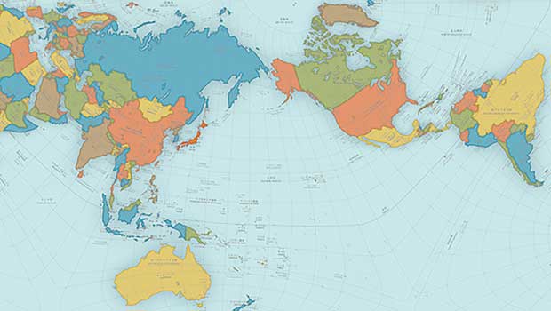
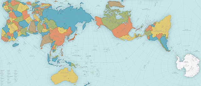
Remember that flat map your teacher used to teach you about geography in middle school? Turns out they may have been lying all of those years about to the true size of the continents.
When maps are drawn out flat, the countries and continents tend to get a bit distorted. Greenland and Antarctica grow vastly larger, while Africa emerges much smaller in size. However, thanks to Japan’s Good Design Award contest, a new map is putting everything back into perspective.
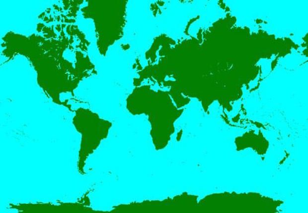
Hajime Narukawa at Keio University’s Graduate School of Media and Governance in Tokyo beat out over 1000 entries with his redesigned map titled, the AuthaGraph World Map. The AuthaGraph World Map remodels the world, showing it more true to size.
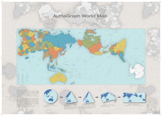
So, what makes the AuthaGraph World Map different from the classic map?
Narukawa didn’t line up the continents in a straight line, but instead angled them in a way to show a “more accurate representation of the distances between them,” reported Mental Floss.
“AuthaGraph faithfully represents all oceans [and] continents, including the neglected Antarctica,” reported Good Design Awards, and provides “an advanced precise perspective of our planet.”
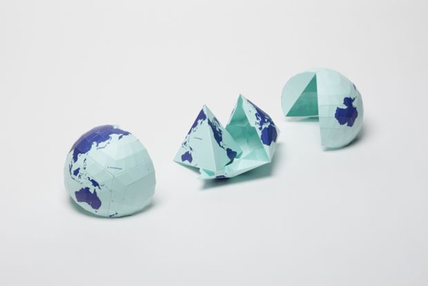
The map is being used in Japanese textbooks to teach an accurate representation of the size of the continents. The map is also represented in a textile version with paper kits that allow the users to transform the flat map into a cone then a sphere, mirroring how the Authagraph keeps the map true to size.
Looks like we better start updating our history books!
Advertisement - Continue reading below
Share
On Facebook
