Advertisement
Science & Tech
This Easy-to-Understand, 20,000-Year-Long Chart Perfectly Captures Urgency of Climate Change
By
Jason Owen
3 min read
- # Climate Change
- # global warming
- # Randall Munroe
Advertisement - Continue reading below
Strangely, there’s a heated debate amongst many Americans over the legitimacy of climate change. Despite an overwhelming majority of experts (97%) saying the climate is changing and the consequences will be devastating, almost one-third of Americans do not believe the climate is changing. And even some of those who do believe the climate is changing do not believe it’s an important issue and are natural changes that has occurred on Earth for thousands of years.
This chart just might make them change their mind.
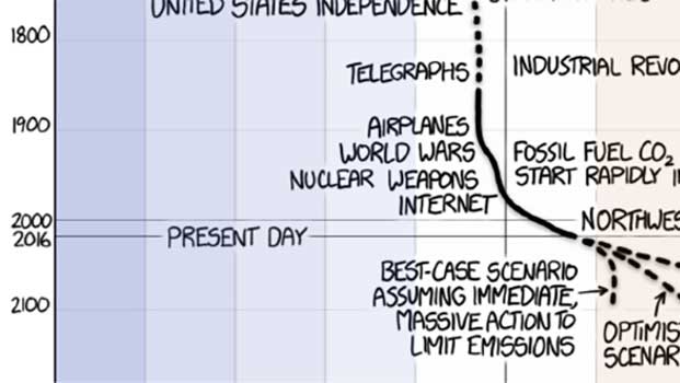
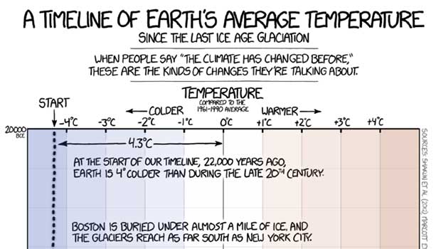
The popular web comic xkcd created a “Timeline of Earth’s Average Temperature” since 20,000 B.C. The chart details the significant changes that have occurred over the last 22,000 years and show in detail the gradual warming of the Earth, that is, until you get to the end where the average temperature line shoots wildly to the warmer side over a relatively short period of just 100 or so years.
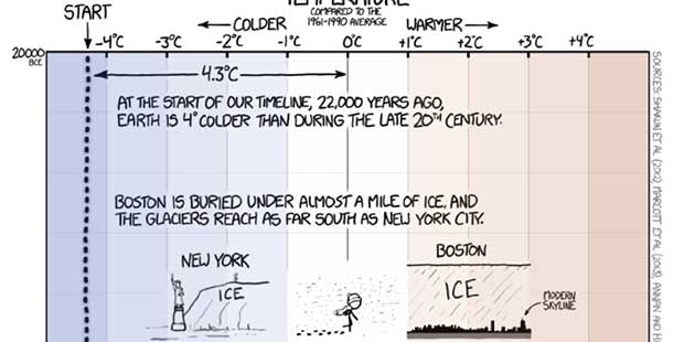
Randall Munroe, the author of xkcd, starts the lengthy timeline when the average Earth temperature was “4° colder than during the late 20th Century,” and the area where Boston will one day be “is buried under almost a mile of ice, and the glaciers reach as far south as New York City.”
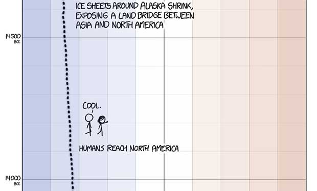
Munroe says the world is already starting to warm and that ice sheets begin to melt, albeit gradually. By around 14,500 B.C., “Ice sheets around Alaska shrink, exposing a land bridge between Asia and North America allowing humans to expand to the new continent.
The Earth continues to warm, again gradually, but around 11,000 B.C., temperatures actually cool a bit, before once again warming some 500 years later.
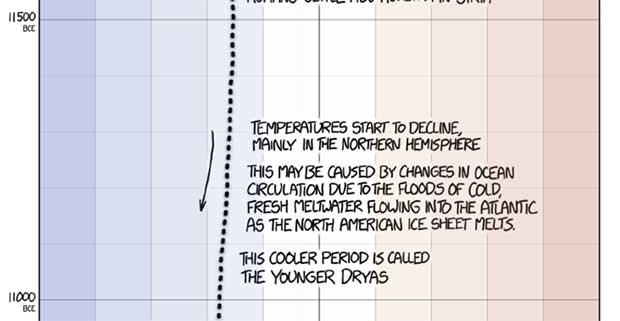
Sometime between 9,000 and 8,500 B.C., temperatures finally reach near modern levels.
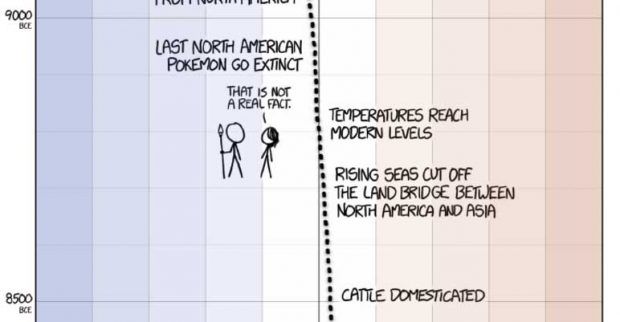
2,000 years later, sea levels approach their near modern levels when Britain is cut off from mainland Europe.
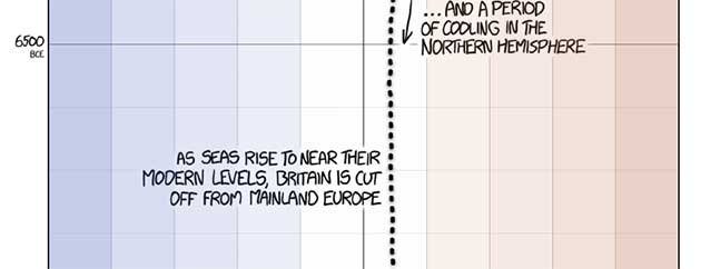
Munroe details several significant milestones in human civilization, but the temperatures remain roughly the same, even declining slightly until 1 C.E.
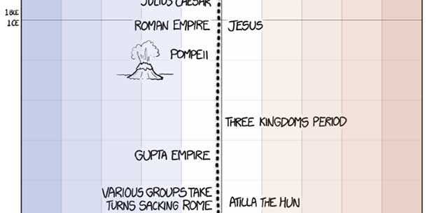
But it’s the end of the chart that should raise some eyebrows among those who don’t put much emphasis on global warming. Munroe shows the “Little Ice Age” of the Medieval period where for several years the Earth dipped below the average.
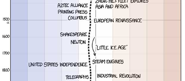
Then, in the 1800’s, things begin to take a turn back toward warming before just after 1900 when there’s suddenly a dramatic shift in the global average that swings the line almost a full degree above the Earth’s average from just a few centuries before.

As Munroe shows, the arguments that the Earth has always changed or that current changes aren’t that worrisome do not hold up under scrutiny. Gradual changes over 1,000’s of years are common, but the rapid changes currently unfolding across the globe cannot be explained as “natural,” and provide a clear danger to the well-being of the planet as a whole.
See the full illustration here:

Advertisement - Continue reading below


